Progressive Rhythm in Art: Meaning and Essence
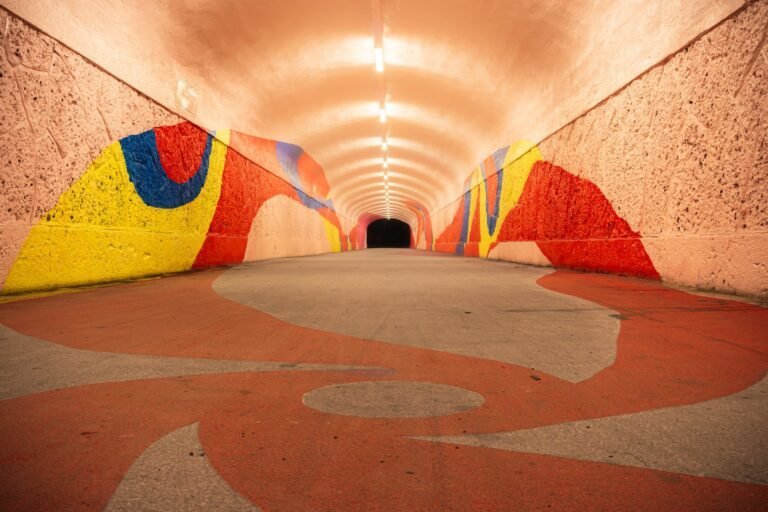
Progressive rhythm in art is a design principle where visual elements are repeated but gradually change in a consistent and predictable way, creating a sense of movement or progression. These changes can occur in size, shape, color, spacing, or direction, guiding the viewer’s eye through the artwork in a smooth, flowing manner. Unlike regular rhythm, which repeats elements uniformly, progressive rhythm in art emphasizes gradual transformation, giving the composition a dynamic and evolving visual effect.
These changes can happen in:
- Size (small to large shapes)
- Color (light to dark tones or one hue to another)
- Shape (gradual morphing from one form to another)
- Spacing (narrow intervals widening or vice versa)
- Texture (smooth to rough or coarse)
- Value (lightness or darkness shifting progressively)
The beauty of progressive rhythm lies in its narrative quality. It tells a visual story—each element is like a frame in an unfolding sequence, pulling the viewer forward and often suggesting movement through time or space. Artists use this principle to guide attention, suggest perspective, and convey mood transitions.
Historical Context of Progressive Rhythm
Although the term “progressive rhythm” is often taught in modern design and art theory, its application has been present in human creativity for centuries. In ancient Egyptian wall paintings, figures sometimes appear in increasing or decreasing size to indicate depth or importance. In Renaissance frescoes, perspective and proportion changes create the illusion of movement through space. Japanese ukiyo-e woodblock prints often show progressive changes in wave height, mountain size, or cloud patterns to create a flowing visual journey.
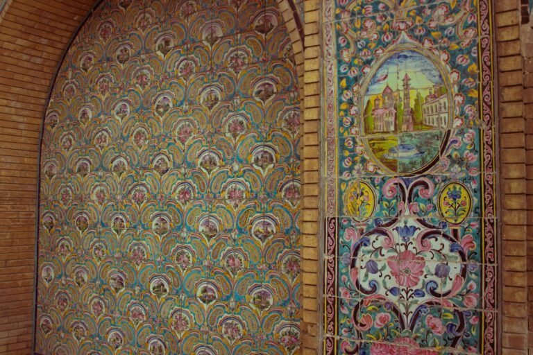
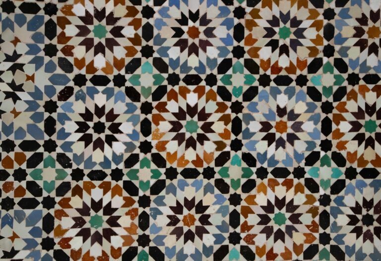
In Islamic geometric art, progressive rhythm can be seen in the gradual expansion of patterns from a central point outward. In Art Nouveau, plant-like forms often grow progressively larger or more intricate as they spiral. In modernism and abstract art, artists such as Bridget Riley explored progressive rhythm through gradual optical changes, creating visual vibrations that seem to move before the viewer’s eyes.
Today, progressive rhythm is a key element not only in fine art but also in graphic design, animation, architecture, and even product packaging—where it’s used to lead the eye and create an emotional progression.
Examples of Progressive Rhythm in Painting
One of the clearest demonstrations of progressive rhythm in painting comes from Georgia O’Keeffe’s floral works. In pieces like Jack-in-the-Pulpit No. IV (1930), the petals gradually increase in scale and depth of color, drawing the viewer’s eye inward toward the flower’s core. The change isn’t abrupt; it’s a smooth, unfolding transition that feels natural and almost meditative.
Similarly, in Claude Monet’s Water Lilies series, the progression isn’t just in size but also in value and color temperature. Moving from the top to the bottom of a canvas, cooler blue tones may warm into sunlit pinks and yellows, while brushstrokes become denser and more textural, suggesting a progression from distance to closeness.
In Bridget Riley’s Op Art paintings, such as Movement in Squares (1961), the shapes progressively elongate or compress, creating a visual “wave” that seems to warp the flat canvas into a three-dimensional illusion.
Progressive Rhythm in Sculpture
In sculpture, progressive rhythm can be expressed through forms that change in scale, shape, or texture along a path. A famous example is Constantin Brâncuși’s Bird in Space series, where multiple works depict the gradual abstraction and elongation of a bird’s form. Across the series, the shapes evolve from more recognizable figures to sleek, streamlined vertical forms—each sculpture representing a step in an ongoing transformation.
In ancient Greek columns, particularly in the Doric and Ionic orders, fluting sometimes subtly changes in depth from base to top, creating a progressive tactile rhythm. Modern sculptors like Alexander Calder have also used progressive rhythm in mobiles, where hanging shapes gradually increase or decrease in size, creating a dynamic sense of motion as they turn.
Progressive Rhythm in Architecture
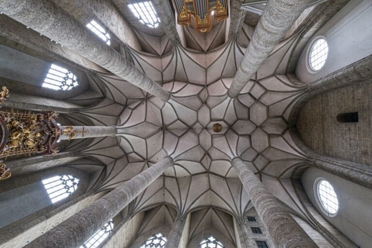
Architectural design often uses progressive rhythm to guide the viewer’s gaze along a structure or to emphasize perspective. The colonnades of St. Peter’s Square in Vatican City, designed by Gian Lorenzo Bernini, use progressively angled columns to create the illusion of embracing arms. When walking along them, the spaces between columns change gradually, creating a rhythmic unfolding of the view.
In Frank Lloyd Wright’s architecture, progressive rhythm appears in the arrangement of windows, ceiling heights, and furniture placement. For example, in the Fallingwater house, the terraces gradually extend further into space, leading the viewer’s eye toward the surrounding nature.
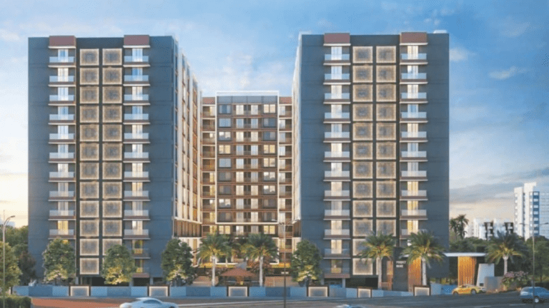
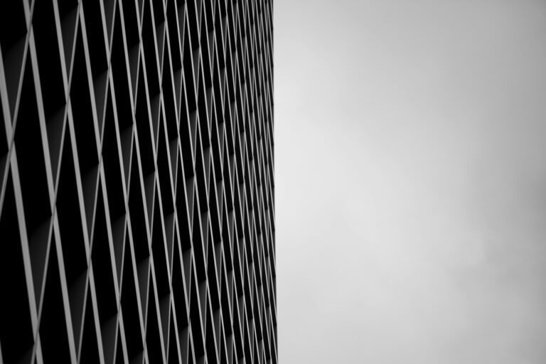
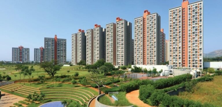
Modern architecture often plays with progressive rhythm through facade patterns—such as perforated panels that start sparse and become denser, or glass panels that increase in size from bottom to top, creating visual lift.
Progressive Rhythm in Photography
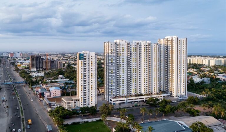
Photographers often exploit progressive rhythm through repeating elements in nature or urban environments. Andreas Gursky’s large-scale photographs frequently show progressive shifts—like rows of apartments where windows slightly change in size or lighting, leading the eye upward.
Nature photographers might capture a line of seashells on a beach, each slightly larger than the one before, or the receding fence posts of a countryside scene where distance progressively reduces their size. The human eye instinctively reads these changes as movement through depth.
In street photography, a progressive rhythm can appear in the repetition of people walking, each at a slightly different distance or carrying variations in color and shape. The progression creates a sense of narrative—like watching time unfold in a single frame.
Progressive Rhythm in Graphic Design
In graphic design, progressive rhythm is particularly powerful because it controls how viewers consume information. A well-designed infographic might use bars that gradually increase in height or color saturation to show statistical change. Brand packaging can use progressive stripes, dots, or gradients to make products appear dynamic and modern.
The iconic Olympic Games posters often use progressive shapes or lines to suggest speed, movement, and energy. For instance, a runner’s silhouette might be broken into overlapping forms that grow larger and brighter toward the finish line, visually expressing acceleration.
Web designers use progressive rhythm in scroll animations, where elements appear slightly larger or closer as the user moves downward, guiding them toward key calls to action.
Progressive Rhythm in Textile and Fashion Design
In textiles, progressive rhythm might be seen in patterns where motifs gradually change in scale or complexity. African kente cloth sometimes includes rows of geometric forms that start small and increase in size, creating a woven sense of progression. Japanese shibori dyeing techniques can create gradients that shift color intensity in a progressive rhythm across the fabric.
Fashion designers like Issey Miyake have played with progressive pleats—folds that start small and open up wider toward the hem of a garment—so the movement of the wearer enhances the rhythm. In knitwear, stripes or cable patterns can be designed to progressively change, adding a dynamic, forward-moving feel to the clothing.
Progressive Rhythm in Ceramics
Ceramic artists often use progressive rhythm in surface decoration and form. A vase might have carved ridges that gradually become wider or narrower from base to lip. Traditional Korean Buncheong pottery sometimes features stamped designs that change in density around the vessel.
Contemporary ceramicists might glaze in gradients, where a color starts pale at the base and deepens toward the rim, or apply repeating embossed motifs that shift subtly in size, leading the hand and eye around the piece.
Progressive Rhythm in Digital and Interactive Art
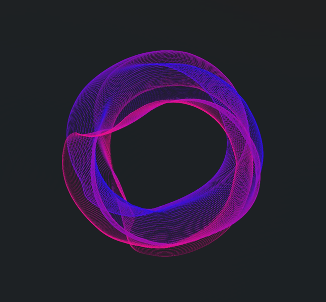
Digital art opens entirely new avenues for progressive rhythm, especially through motion. A looping animation might show a shape that progressively transforms in each frame, giving a hypnotic sense of continuous change. In interactive installations, sensors might trigger progressive changes in light or sound based on the viewer’s movement, making them an active participant in the rhythm.
Generative art programs can create patterns that evolve through algorithmic progression—colors fading, shapes growing, or lines bending in incremental steps. This digital application mirrors the principles found in traditional art but allows for real-time transformation.
Symbolic and Emotional Impact of Progressive Rhythm
Beyond aesthetics, progressive rhythm carries symbolic weight. It can represent growth, passage of time, journey, transformation, or inevitable change. The gradual unfolding can be calming—like watching ripples spread in a pond—or energizing—like seeing a crescendo in music translated visually.
In cultural symbolism, progressive rhythm often mirrors natural processes: day turning to night, tides rising and falling, seasons shifting. This connection to universal experiences makes it a deeply resonant design choice.
How Progressive Rhythm Differs from Other Rhythms
It’s important to distinguish progressive rhythm from other types:
- Regular rhythm repeats without change—steady beats like a metronome.
- Alternating rhythm switches between two or more elements in sequence.
- Flowing rhythm mimics organic, wave-like repetition.
- Random rhythm places elements unpredictably.
Progressive rhythm is unique because it has directional change—it tells you where to look next. It’s almost narrative by nature.
Case Studies of Progressive Rhythm in Specific Works
- M.C. Escher – Metamorphosis II
This woodcut masterfully uses progressive rhythm by morphing images—from checkerboard patterns into lizards, into birds, into cityscapes. Each step is a gradual, logical shift, making the transformation mesmerizing. - Japanese Torii Gates at Fushimi Inari Shrine
Walking through thousands of gates, each slightly smaller or larger depending on direction, creates a living progressive rhythm. The repetition and change make the journey almost dreamlike. - Andy Goldsworthy’s Nature Installations
Goldsworthy often arranges leaves, stones, or ice in sequences that grow or shrink, change color, or twist—reflecting the rhythms of nature itself. - Van Gogh’s The Starry Night
While known for its swirling patterns, the sky also contains progressive rhythm—the stars’ halos increase and decrease in a flow that guides the eye across the canvas.
Practical Applications for Artists and Designers
When creating progressive rhythm:
- Decide which element (size, color, shape, spacing, texture, value) will change progressively.
- Keep the change consistent and measurable—the eye detects patterns better when the progression is logical.
- Use it to guide focus: start small and dim near the edge, growing larger and brighter toward your focal point.
- Combine it with perspective to enhance depth.
- Remember emotional tone: smooth, gradual changes feel serene; rapid, sharper progressions feel more energetic.
Conclusion
Progressive rhythm in art is more than just an aesthetic tool—it’s a storytelling device. Whether in a painting’s brushstrokes, a sculpture’s curves, an architectural façade, or a textile’s pattern, it provides a sense of journey. It captures the beauty of change, mirrors nature’s subtle transformations, and keeps the viewer’s gaze moving smoothly through the work.
By understanding and applying progressive rhythm, artists and designers can lead viewers on a journey—not just through space, but through a visual narrative of transformation.


